Document Structure
Enhancing Product Design Efficiency
Digital design tools today have rapidly evolved to support the intricate needs of product designers. Among these tools, Figma has emerged as a clear front runner, it’s my current tool of choice. Figma has redefined the landscape by offering a truely collaborative experience where designers can create and iterate in realtime and collaborate with developers and stakeholders.
While its features have made it beloved by many, we have to acknowledge that the sheer power of this tool can quickly lead to chaos. Without proper organisation, the vast canvas of Figma can quickly turn from a playground of creativity into a maze of confusion - even for you, the designer working in the document.
The Chaos of Unorganised Design Documents
It doesn’t matter if you use Figma, Sketch, Lunacy, Penpot or the new flavour of the month, the importance of well organised design document remains critical to your sanity and those around you, especially when working with large cross functional teams.
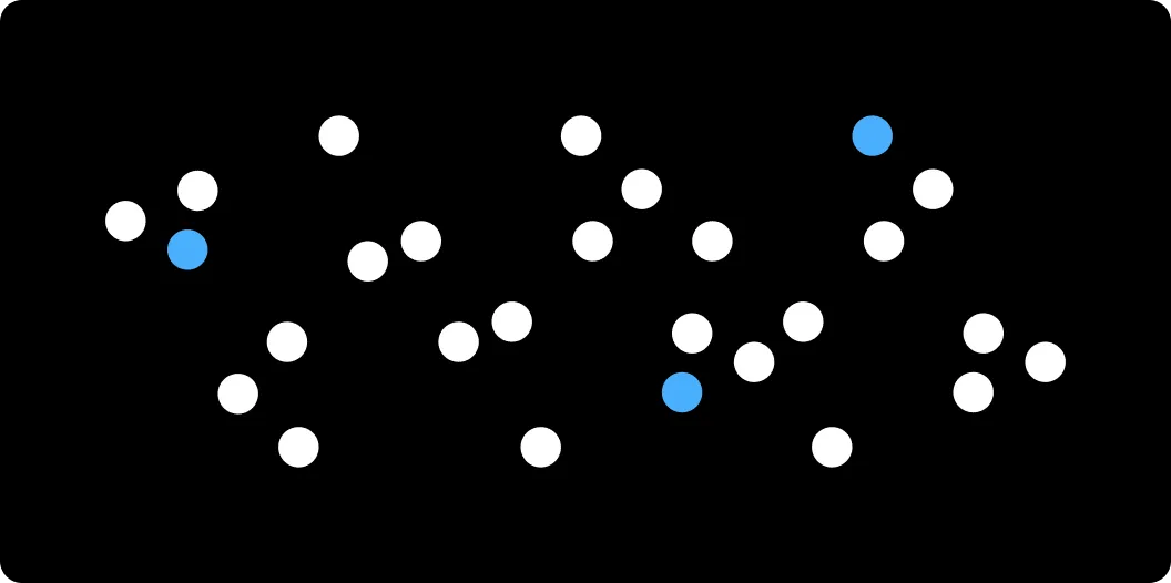
Navigating through a cluttered design document is like trying to find a needle in a haystack. I’ve spent countless hours in my design career amongst the chaos, some of which I’m sure I have caused. I have seen my fair share of how quickly things can get out of control. There is nothing worse from a Design Manger or Lead point of view than opening a document only to be greeted by the seventh circle of hell.
As designers, our primary focus should be on crafting the best user experience and not on battling the chaos of disorganisation. Yet, when your design document aren’t organised efficiently, the latter often becomes your new reality.
Here’s a closer look at the challenges and issues stemming from a disorganised design document.
Wasted Time
Never-ending Navigation — Designers often find themselves endlessly panning around a seemingly infinite canvas of sections, frames and components. Instead of quickly getting to the task at hand. This unnecessary hunt is not just frustrating but also breaks the creative flow, slowing down the overall design process.
Mental Load — Beyond the physical time wasted, constantly searching for screens and components adds an unwanted cognitive load on the designer, product manger or developer. Instead of focusing on design decisions, mental energy is spent on remembering where a particular element might be hidden.
Duplication of Assets
Reinventing the Wheel — When existing components or screens are not easily found, designers might inadvertently design a new one from scratch. This leads to multiple versions of similar assets, taking up additional space and creating confusion about which version to use.
Consistency, or Lack There of — Duplicate assets might not be exact replicas. Minor differences in these assets, if used interchangeably, can introduce inconsistencies in the design, affecting the overall user experience.
Ambiguity
Lost in Translation — Without a clear organisational system and naming convention, what makes sense to one designer might be utterly perplexing to another. A universally agreed upon structure must prevail.
Decision Dilemmas — When multiple similar assets exist due to a lack of clarity, designers and developers face dilemmas about which assets to use, leading to design decision paralysis.
Lost Feedback
In a crowded design document, feedback comments and sticky notes can get overshadowed by the sheer volume of design elements. These overlooked comments can contain critical insights or revision requests that, if missed, can lead to design errors or iterations that don’t align with stakeholder expectations. Without a complete view of feedback, designers might find themselves making changes based on partial inputs, leading to incomplete solutions.
Lingering Legacy
As projects evolve, so do designs. However, in a disorganised design document, outdated designs linger alongside newer versions. When designers, especially those who might not have been part of earlier project phases, access these files, they might inadvertently use outdated layouts and components that now find their way back into the design, detracting from the user experience and possibly reintroducing solved problems.
A disorganised design document is more than just a visual chaos. It’s a tangible impediment to a designer’s efficiency, communication, and overall consistency of the final product. The ripple effects of this chaos can be felt not just by the designer and the design team but also by developers, product managers, and most certainly the end-users.
The Benefits of a Clean Design Document
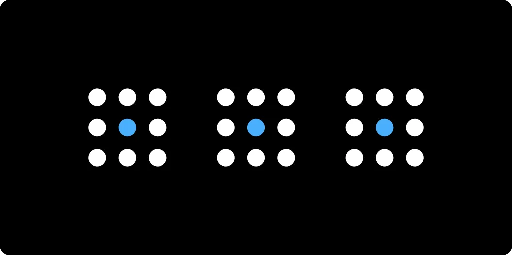
A neatly organised design document is comparable to a well-tuned orchestra — every element has its place, purpose, and function, all working in harmony to produce a flawless symphony. Designers, just like conductors, should appreciate the power of order in shaping the rhythm of their creative work. Let’s dive deeper into the benefits of maintaining the order.
Boosted Efficiency
Swift Access — A well-structured design document ensures that every screen, component, and asset is easily accessible. This drastically reduces the time spent hunting for specific elements, allowing designers to invest more time in ideation, iteration, and implementation.
Reduced Redundancy — An organised document minimises the risk of duplicating assets. With clear visibility into available components, designers can efficiently reuse elements, ensuring streamlined design processes and consistent visual outputs.
Enhanced Collaboration
Unified Understanding — With clarity in asset naming and structure, team members can easily comprehend each other’s work. This unity of understanding fosters better collaboration, ensuring the team moves cohesively towards a shared design vision.
Feedback Finesse — In a decluttered space, feedback can be given directly on relevant design elements without any distractions. This ensures that all comments are easily visible, reducing the chances of oversight and enabling more effective design iterations based on consolidated inputs.
Adaptable Designs — A clean desing document is more adaptable to changes. As business requirements evolve or user feedback flows in, designers can quickly iterate on existing designs without wading through chaos, ensuring the product remains agile and user-centric.
Robust Design Consistency
Uniform User Experience — An organised design document promotes the consistent use of design elements. This consistency ensures that users experience a uniform interface, irrespective of the screen or feature, reinforcing brand identity and enhancing usability.
Consistent Design Language — With easy access to the latest components and a clear view of the entire project, designers can ensure that the established design language is consistently applied across all screens ensuring intuitive interactions for users.
Positive Development Impact
Clearer Handoffs — An organised design document facilitates smoother transitions between design and development phases. Developers can easily locate assets, understand design specifications, and implement interfaces with reduced back-and-forth, ensuring faster time-to-market.
Aligned Stakeholder Vision — When presenting designs to stakeholders, a well-structured document presents a clearer narrative, helping stakeholders quickly grasp design intents, user flows, and key interactions. This clarity fosters better decision-making and ensures that the entire team is aligned with the product vision.
A clean and organised design document is more than just an aesthetic choice; it’s a strategic one. It paves the way for designers to work at their optimum, collaborate seamlessly, produce consistent outputs, and drive the entire product development process with clarity and precision.
A Take on Creating an Organisational System
By structuring design documents consistently, teams can achieve heightened efficiency, avoid common pitfalls, and streamline collaborative efforts. In this section, I will outline a proposed document structure, which might just resonate with you, to help establish and maintain clarity and coherence throughout the design process.
Get a jump start and hack on the Document Template Figma file I have created.
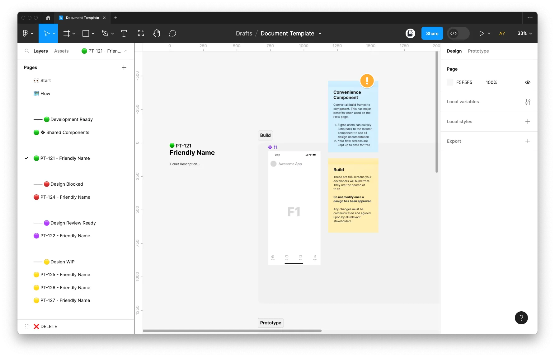
Proposed Document Structure:
👀 Start
This initial page sets the stage and offers an immediate understanding of the project’s scope and stakeholders.
- Who — It’s more than just names; it’s about roles and responsibilities. Mentioning the major contributors to this project here makes it easier to reach out to during and after development work. Including direct communication links saves time, especially in large teams or cross-functional projects.
- What — Giving a quick description and insights to the project here helps give context to people viewing the design document. This would be a perfect opportunity to link to the overall project documentation in places such as Confluence or Jira.
- Thumbnail — Figma thumbnails can offer a wealth of information at a glance when browsing through projects in Figma. Add dates, project statuses or any other detail that makes you and your teams life easier.
🗺️ Flow
The Flow provides a birds eye view of the product or feature showing all possible paths a user may take. The Flow should be routinely updated as work progresses.
🟢 Development Ready
Pages under Development Ready should be approved and ready for handover. Once a page appears hear there should be no further changes unless communicated with to the development team and agreed upon.
🔴 Design Blocked
Design work that is currently blocked. Clearly indicate the reasons or dependencies causing the blockage in order to help achieve a faster resolution and better project management.
🟣 Design Review Ready
Pages under Design Review should be clearly documented ready for review.
🟡 Design WIP
Pages under Design WIP are currently in progress.
⚫️ Design On Hold
Pages under Design on Hold contain work that is currently on hold. Clearly indicate the reasons as to why the work is on hold.
🧭 Exploration
Pure explorative work. Whilst a designer has a lot of freedom in this space it is still advisable to have some sort of organisation practice here that is shared across the team.
You may have multiple explorations within your working file. I would recommend ordering these in a descending order so the most recent is always first.
Pro Tip
The 🟢 Development Ready, 🟡 Design WIP, 🟣 Review, 🔴 Blocked and ⚫️ On Hold pages are marked with specific colours to help quickly identify status. I know this will have accesibility issues, so please swap them out if they do not work for you and your team.
Each individual page within these sections should contain a consistent structure in order to make your design document far more discoverable and predictable. In my document template example I have clearly defined sections for User Tasks (Linear Flows), Prototypes and one off Components. This works for me at the moment, but you can always tweak the template so it works for you!
Staying Updated and Iterating
Scheduled Clean-ups
Just as you might schedule regular design reviews, set aside dedicated time for design document clean-ups. This could be at the end of a design sprint, post a major feature release, or even a set time every week.
Archive Work
As designs evolve, certain components or screens might become obsolete. Instead of deleting them, create a named saved point in your document history. Simply go to “File > Save To Version History” and name your save point with a relevant name and description, hit save and then delete the designs you no longer require. By utilising this built in Figma feature you will not only declutter your design document but you will be improving the overall performance.
Feedback Loop and Iterations
Regularly solicit feedback from team members about the organisation of your design documents. Different users might have varied experiences, and their insights can offer valuable perspectives on how to improve the file’s structure.
Just as you would iterate on a design based on user feedback, be prepared to evolve your organisational methods. As the team grows, projects scale, or design complexities increase, the initial organisational approach might need modifications. Be flexible and willing to adapt to ensure the workspace remains efficient.
Conclusion
An organised design document is an indispensable asset for product designers. It serves as the bedrock upon which creativity can flourish, collaborations can thrive, and user-centric designs can be meticulously crafted. By investing time and effort into maintaining your design documents, you are setting the stage for design excellence.
I encourage you to invest in your design document organisation and watch as the foundational clarity amplifies your design powers and elevates your design brilliance.
Good luck, it’s a jungle out there!